WEEK 6
Before jumping into experimenting with publication-making like I did in the past few weeks, I took a little step back to do some research both from research papers and did some interviews to gain different perspectives on this subject matter
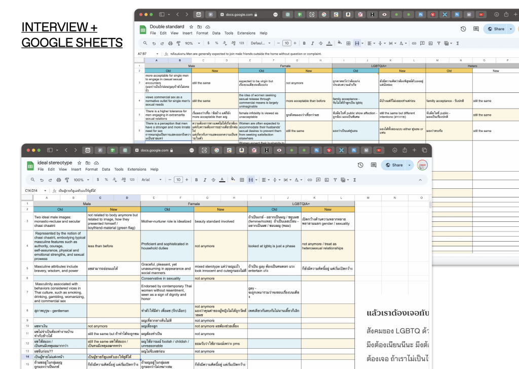
As I continued researching Thai attitudes towards sex, I stumbled upon this book called The International Encyclopedia of Sexuality By Robert T. Francoeur, which explores the intricate landscape of sexuality in Thailand. The book delves into societal attitudes towards commercial sex, homosexuality, and gender roles, highlighting the tensions and shifts within Thai society. Traditional gender norms, patriarchal structures, and perceptions towards sexuality are discussed along with the challenges and advancements faced by women and LGBTQ+ individuals. Their tone of voice is surprisingly neutral, which I found helpful for some topics and also helped me shape my content on the publication and form the interview questions
Back to my practice, the feedback I got last week on the design choices that I made wasn’t really reflecting on the topic of sex or not being sensual enough, so during this week, I then started by asking myself, “What do I want to communicate?”
- Provoke reflection and challenge the existing relationship between sex, individual and society
- To inspire an open conversation about sex
- Push the limit of publication? (how the audience engages with content)
The list above is the answer I gave last week; as I reflected back, I noticed what was missing: “What do I want to communicate visually?”
- Give a sense of “Dual” where everything has two sides (can be shown in content ex. different perspective / can be shown visually ex. way of reading)
- I don’t want it to be a research paper or educational book
- I want people to feel a sense of sensual and erotic feels
Material
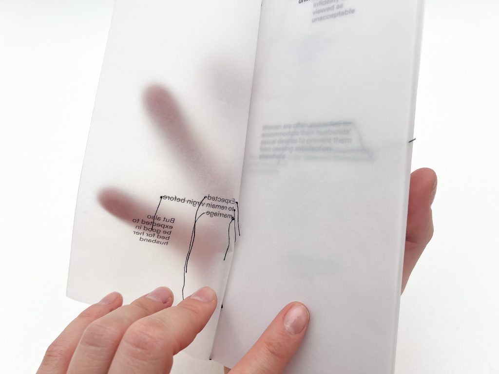
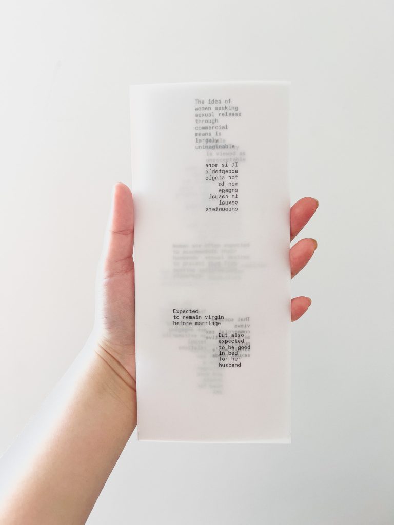
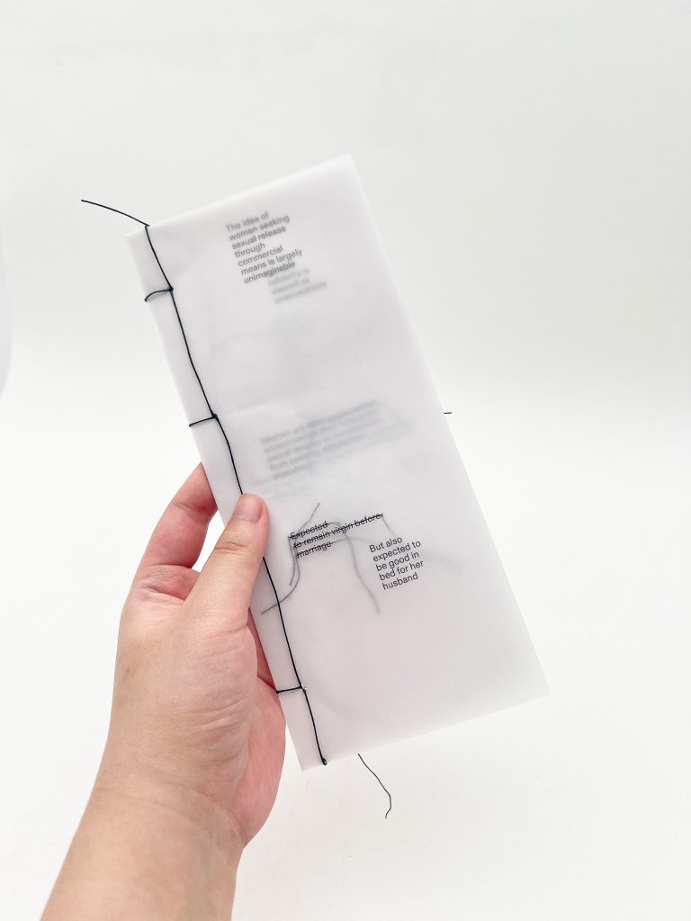
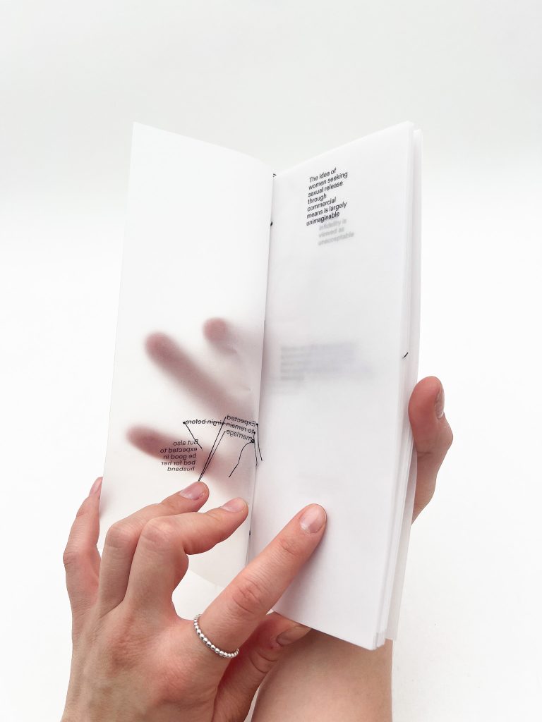
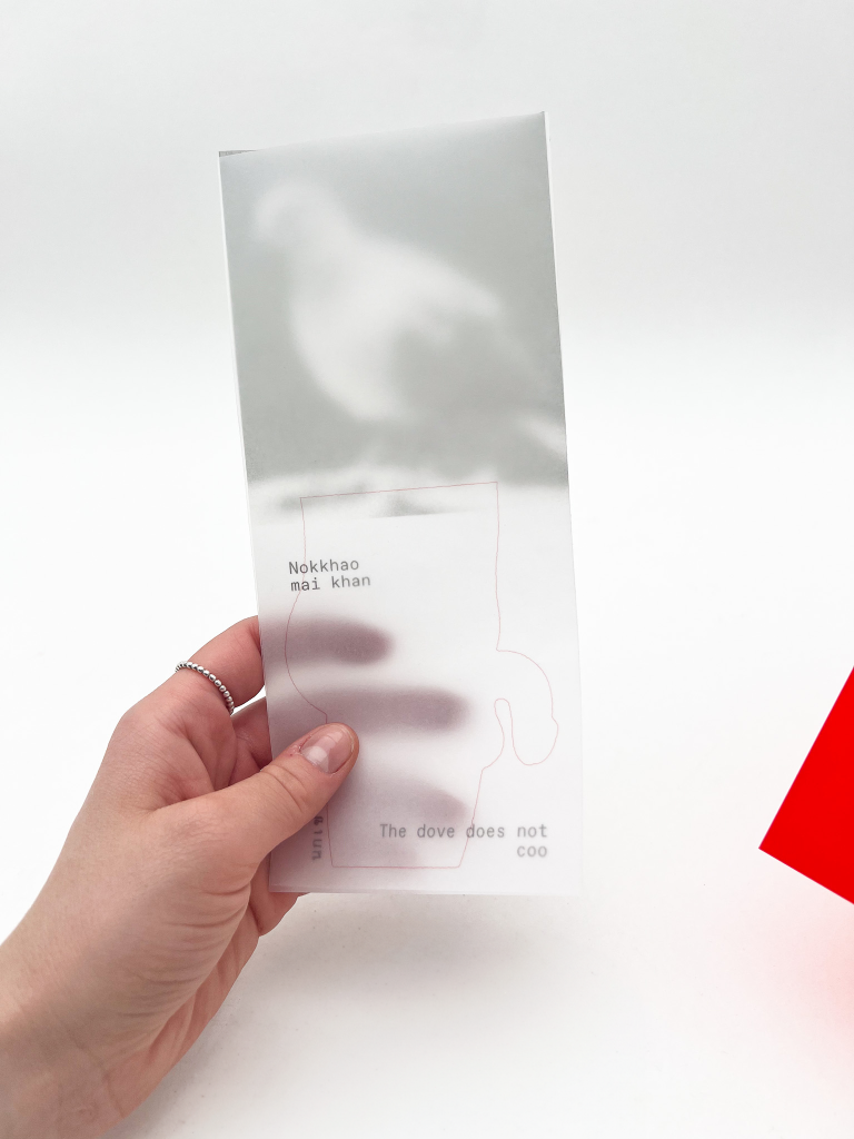
So, I began to question about material that I use. I began to switch to tracing paper as it is transparent, but it’s not so clear, which gives a sense of haziness and makes everything more mysterious and sensual
I also found the interesting effect that tracing paper made with our own hand which is interesting, and I’m trying to develop a way to interact with it
Size
As for the size of this publication, I want to keep it to this, which is similar to a leaflet. One reason is that I want people to interact with it by hand so the size being this iPhone-like is to force the audience to pick it up. And the other reason is I find leaflets make you feel less intimidated when consuming the content
Binding
I was experimenting on the way to get the hand effect on tracing paper so I made both a bind version and unbind version
According to that, I made three publications highlighting “Dual” in “the duality of Thai culture towards sex” in three different techniques
01 Sewing
With this publication, I tried to communicate what the new generation feels about society by sewing onto the text to present a conversation between the older generation and the younger generation

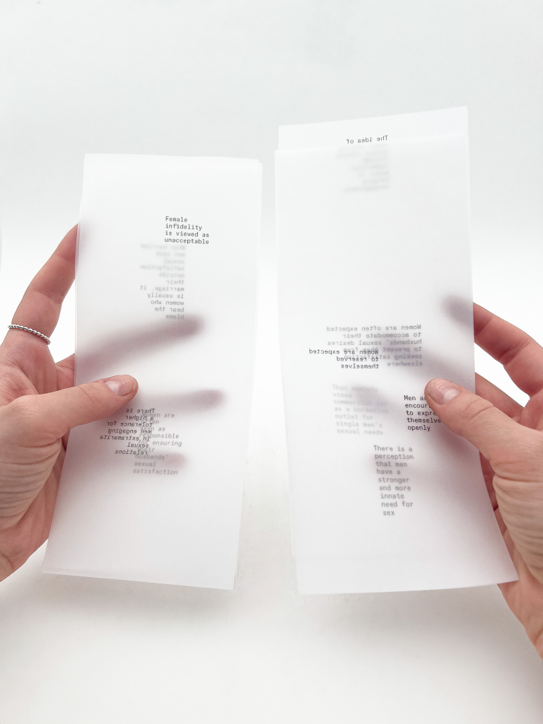
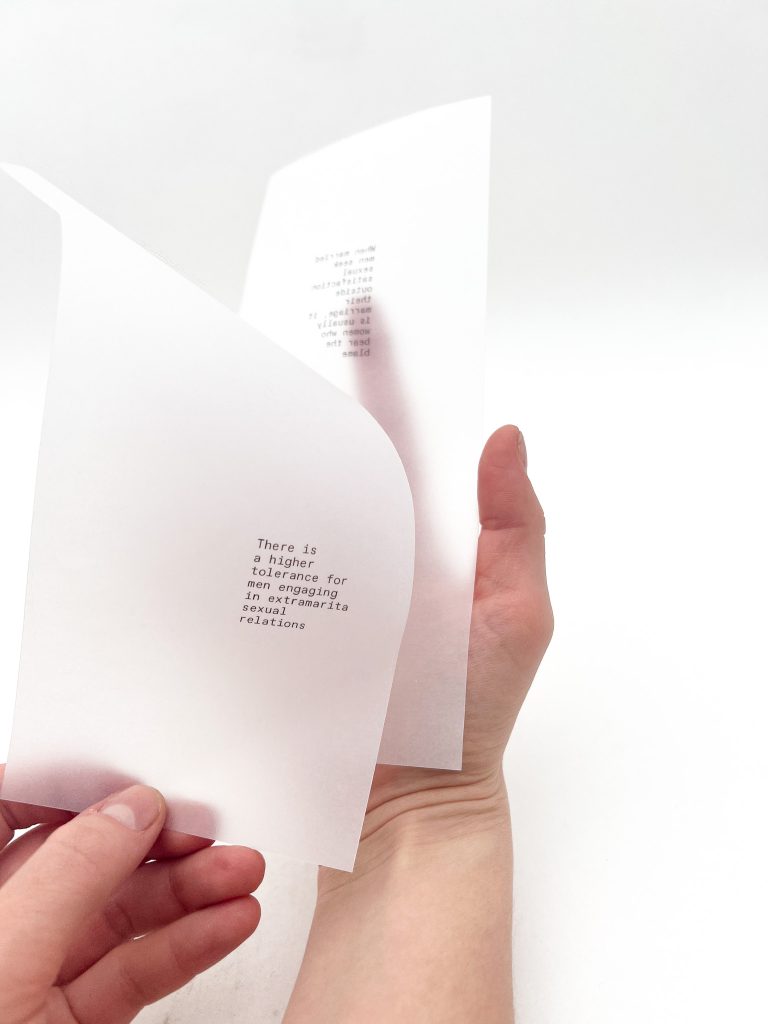
02 Flipping / Reflecting
In this publication, I wanted to show a double standard for sexuality and gender stereotypes in Thai culture. Flipping back and forth shows different treatments for men and women
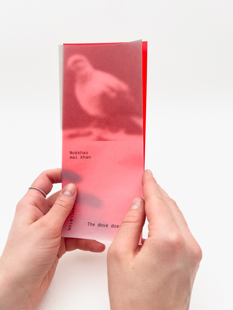
03 Hiding / Revealing
In this one, I tried to redo last week’s publication to fit this concept using the same design language. The publication consists of euphemisms or makeup words/phrases about sex and its meaning. I used red transparent film as a way to reveal and conceal the real meaning of the phrase, which seems to be too explicit for Thai culture
FEEDBACK
- Seems like I was into exploring material ambiguity
- Think about sensuality. What form do I think it is if I have to convey it in visual
- The colour and text resemble a doctor’s report
- Reflect back and think if the publication is the right medium?